

Let’s be real for a sec:
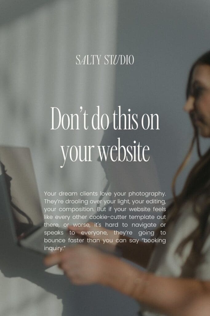
Your dream clients love your photography. They’re drooling over your light, your editing, your composition. But if your website feels like every other cookie-cutter template out there, or worse, it’s hard to navigate or speaks to everyone, they’re going to bounce faster than you can say “booking inquiry.”
Because here’s the truth: your dream clients aren’t just buying pretty photos. They’re buying you.
And if your website is 100% portfolio and 0% personality? You’re losing them.
I see it all the time, photographers with stunning portfolios but websites that quietly scream, “I’m not the one.” RIP.
But the good news?
A few strategic tweaks can flip the script.
Let’s talk about the dos and don’ts of a photography website that not only looks pretty but actually converts your dream clients into paying clients.
Save for later
The Do’s and Don’ts (That’ll Save Your Brand)
1. Reflect Your Brand (Don’t Look Like a Template)
DO: Infuse your website with you. Showcase your unique approach, share your process, and weave in your client experience. Need inspo? Amanda Shupe Photography is a prime example of a brand that feels like her.
DON’T: Slap up a generic bio and call it a day. Your clients don’t care (yet) about how long you’ve been shooting, they care about how you’re going to make them feel.
Showit’s pro tip: Your bio should show how your skills benefit the client, not just list accolades.
Ready to refine your brand? Grab the Brand Strategy Workbook and get clear on what sets you apart.
2. Guide Visitors with a Clear Call-to-Action
DO: Make it stupid simple for visitors to know what to do next. Whether it’s booking a consult, filling out an inquiry form, or viewing your packages, guide them.
DON’T: Leave them guessing. A confusing or missing call-to-action is a surefire way to lose a lead.
Pro tip: Every page should have a path to action.
Not sure what your call-to-action should be? Check out the strategy behind a converting website for ideas that actually work.
3. Optimize for Mobile
DO: Make sure your site is easy to navigate on all devices.
DON’T: Assume your desktop design will translate. 60 %+ of web traffic comes from mobile. If your site doesn’t work on a phone? Forget about it.
Grab my free link in bio template, fully optimized for website to get started!
4. Nail Your Messaging
DO: Speak directly to your dream clients. Use language that resonates with them.
DON’T: Talk about yourself the whole time. Make it about the experience you provide and the transformation you create.
A website without clear messaging is like taking photos in bad lighting, it just doesn’t land.
Photographer-Specific Do’s and Don’ts
Curate Your Portfolio
DO: Showcase a curated selection that tells a story.
DON’T: Overwhelm visitors with every photo you’ve ever taken. (No one needs to scroll through 400 images from one wedding.)
Show Off Client Love Where It Matters
DO: Place testimonials next to your portfolios where they’ll be seen.
DON’T: Hide them on a separate page that no one clicks.
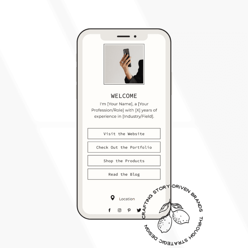
Create Clear Paths for Different Clients
DO: Help clients self-select. Weddings, elopements, families, give each their own space.
DON’T: Make people dig for pricing or packages. If they have to hunt, they’ll bounce.
Curious how this looks in real life? Browse my portfolio for examples.
Save for later

The Bottom Line?
A website that’s strategy-first, design-second doesn’t just look good, it works.
Here’s how we roll at Salty Studio:
- Strategic Foundation: We start with your dream client in mind. Who are they? What do they need to hear from you?
- Strategic Layout: Every section guides them from curiosity to conversion.
- Purposeful Design: The visuals support your message, never compete with it.
- Conversion Optimization: Clear, easy paths to action that turn browsers into buyers.
Because IDK about you, but there’s nothing worse than your website quietly telling your dream clients, “I’m not the one.”
Let’s fix that.
Ready for a website that works as hard as you do?
Explore my full services, from custom web design to brand strategy, and let’s create a site that actually converts.
Or if you’re feeling DIY but want some support? Head to the shop for templates and resources designed to help you stand out.


")

Your Comment Form loads here